
He has honed his sidebar down to the essentials. He only shows his latest series of paintings, drawings, and sculptures. This is difficult for artists to do, including myself. One always want to parade everything one has done in the past so that people know what we are capable of. But the weakness in that is that the older your work, often the weaker, more obsolete, more juvenile it can be. At least in my case that is true. I am continuously cutting out the oldest work from my site. Even I don't feel I cut enough.

Another installations shot that the front page shows.

Here I have clicked on Andy Denzler's paintings page. The work appears in small thumbnails, easy to see and one can click on them for an enlargement. It is simple and effective. If I had full control of a site like this I would get rid of the lines around each work and make sure each series fit on one page, not having to toggle through more than one to see all the thumbnails.

I only recently came across Hillary Kupish's site (above). This is the last word in minimal and clean. I absolutely loved it so much that I even thought of going this minimal for my own site. Unfortunately I couldn't fit much in if I did. Although I have cut and amalgamated different elements in my new website, I could not get it anywhere as minimal as this fantastic site. This is a great site built in Squarespace with the Supply template.

Cybele Ironside's site works so well. She has a single series on her front page and each time you click on one image it enlarges and the rest remain visible in thumbnail underneath as you scroll down. A sharp looking site built in Squarespace using the Avenue template.

Michael Smyjewki's site is also the Avenue template in Squarespace. This template seems to function really well for designers like Michael. He has each square sample on the front page expanding into a scrolling downward gallery (blog-like) that continues on the theme of that one thumbnail. I wasn't sure how this would work for artists who might have 15 images. I don't want to have to scroll through a long body of work.

Then I clicked on Michael's "photo" link and saw there were other ways to display work. Again, he chose the grid gallery, but when you click on one of these you get a light box that enlarges only one image at a time.

Charlie has been one of my favourite local British artists. She recently had her site redone by web designers and it looks great. She uses the single "impact" image on the front like Andy Denzler does, you can click to her gallery grid page. It wasn't until I designed my own site on Squarespace using the Avenue template that I realised that is exactly what her web designers have used for her.
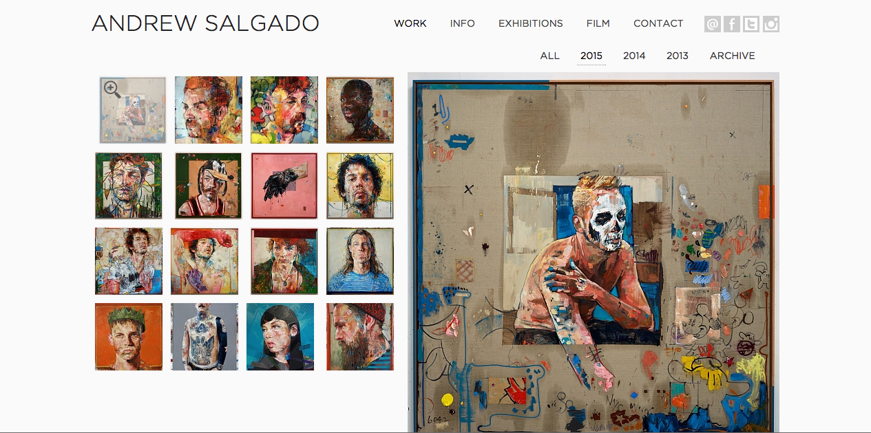
Andrew Salgado has the template look I was searching everywhere for. I was ultimately looking for a grid on one side and an enlarged image of whichever thumbnail you clicked on on the other. This has alluded me to this day. I like to keep it all simple and all visible at all times. This site does exactly that.

Finally, Mario Hugo had such a beautiful and innovative site that I just had to include it too. It really works for designers, I am not sure it would for artists.
I took an excellent workshop run by the web designers, prettysmartsites.co.uk, at the City Business Library in London, UK, which was excellent. It was entirely aimed at the small business. Most of the common sense advice given worked for an artist's website. Here were some of their ideas:
Qualified Traffic + Well-Optimised Website = High Rate of Conversion.
WHAT MAKES A GOOD SITE:
-Easy to manage
-Presents company in good light
-Attracts Traffic
-Converts Traffic to sales/sales enquiries/other types of conversions (newsletter sign up for me)
-Pays for itself
How will I bring traffic to the site?
Who are main competitors and what are they doing?
What is the image you want to create?
What is purpose of site and overall aim?
SOURCES OF TRAFFIC?
-Search engines
-Online ads
-Web properties (ie. blog, tumbler),
-Social networks
-Other websites (ie. twitter, pinterest, Facebook, twitter)
-Print Materials (leaflets, business cards)
-Real World (networking)
Every page is a door (add images to cv/bio, etc). Blogs are excellent as they are always changing and adding new content. This is good for repeat traffic as well as Google rankings. Every page must have a goal to fulfil (sales funnel: blog on icons>view icons>prices). Every page needs a call to action (to buy, request a call, download, fill in contact form, or select another page to view).
DON'T
-Use others' images
-Bury content in Flash (flash is not compatible with iPhones or iPads. Recently Google also has downgraded any site that is not responsive, meaning the layout does not adapt to different devices like mobile phones)
-Use music/ videos that start on the page load (very intrusive)
-Use splash page/ Flash intro
-Force downloads or plug-ins to view content
-Ask too many question in Sign In box (name and email max)
No comments:
Post a Comment